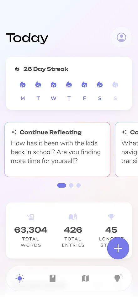


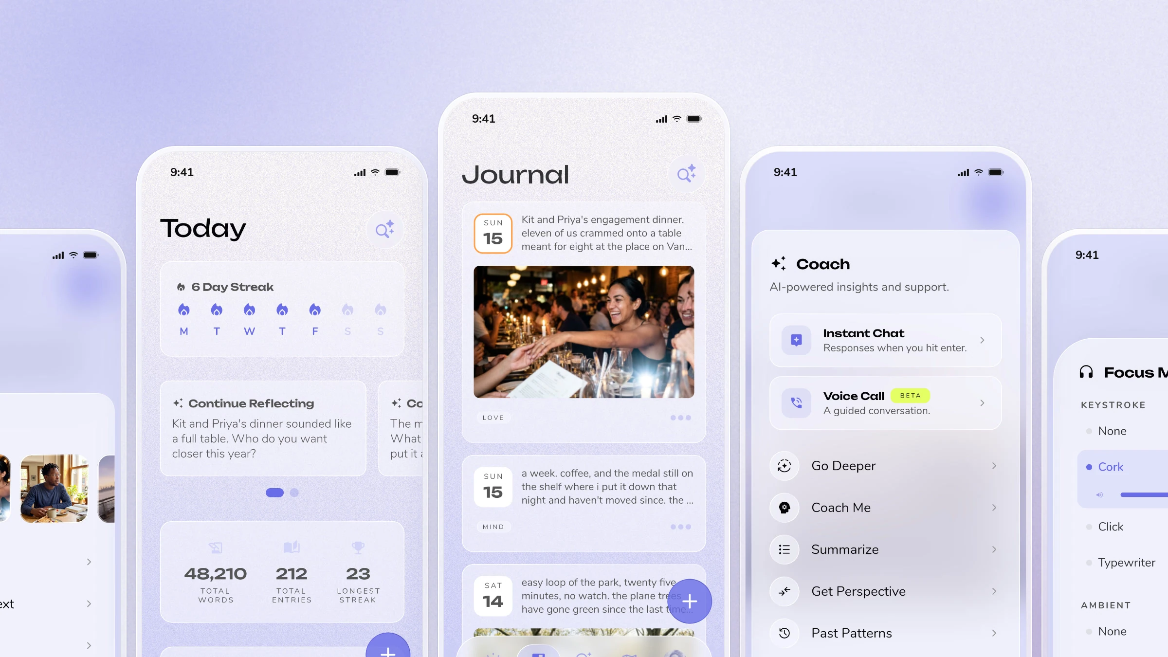
Reflection v7 will be our largest release of the year, and it's coming in just a few weeks. We've spent months rethinking the app's experience and design, and we're excited to share a fresher, more intuitive Reflection. V7 goes out to our beta group shortly, and will be available to everyone by the end of October.
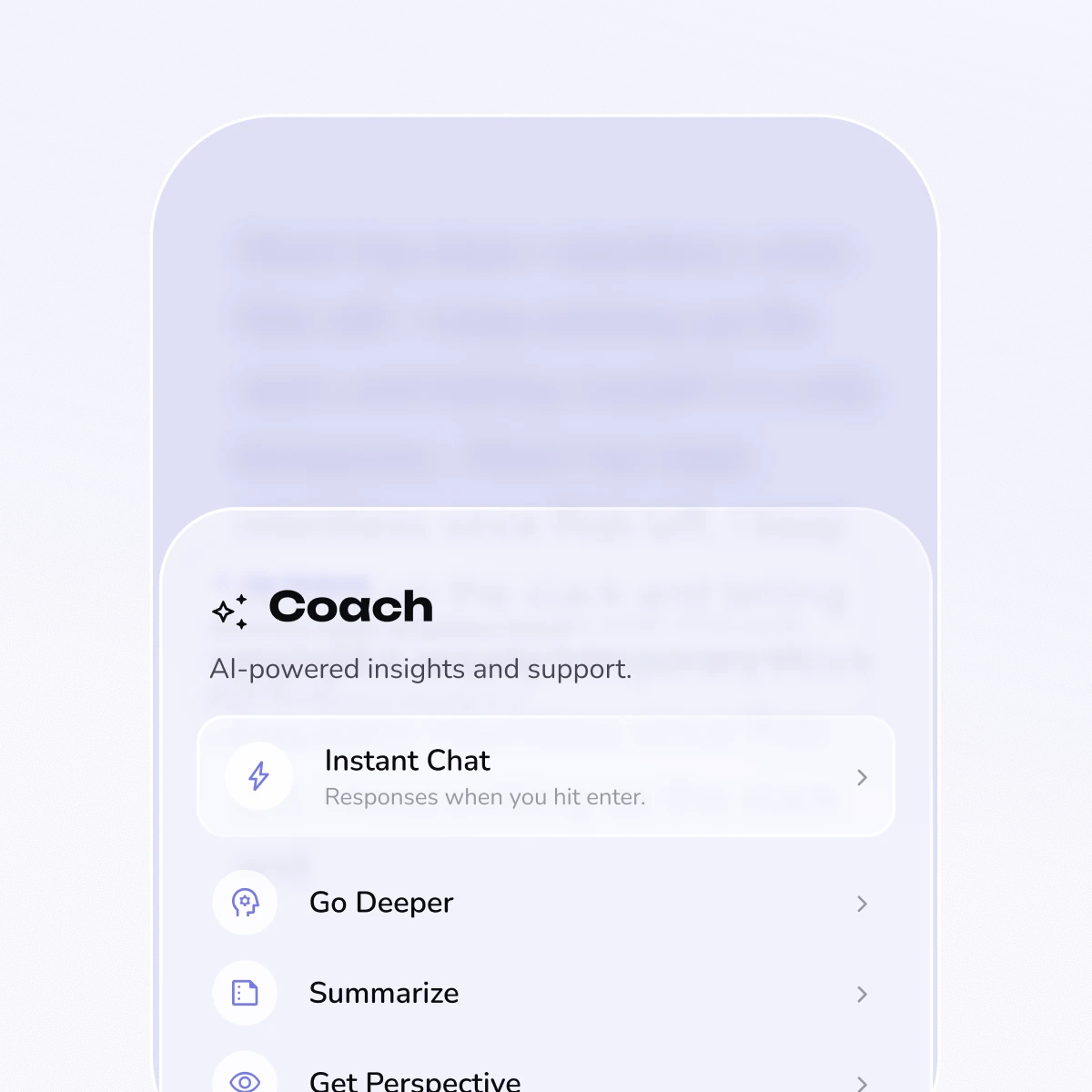
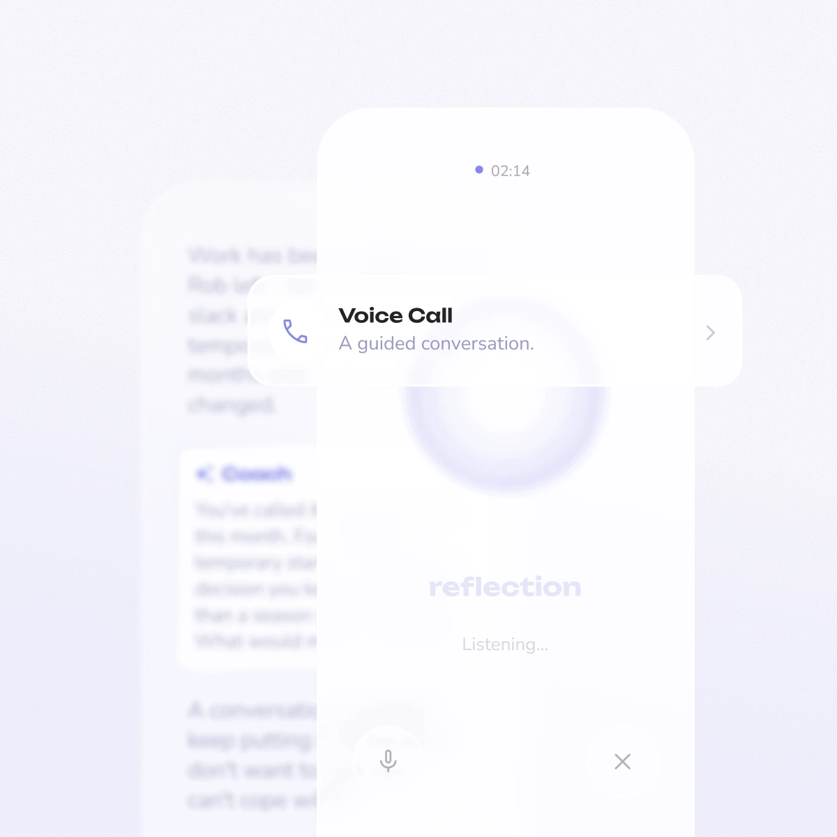
Coach has grown a lot in the last couple of years — guidance, deeper questions, quick actions, live voice. Each addition landed somewhere new, and it got scattered. v7 pulls it back into one place, with clearer names: everything that helps you go deeper is Coach, and the real-time two-way conversation is now Voice Call.
One button. A chat toggle, a mic, and a sparkle icon are now a single Coach button. It opens one sheet — Instant Chat and Voice Call at the top, quick actions below.
Instant Chat replies inside your entry. No more typing in one place and reading the answer in another. Write in the entry, press Enter, and the reply appears on the next line.

Everything you can put into an entry now sits behind one button — photos, dictation, scanned handwriting, templates, prompts. The editor toolbar went from six unlabeled icons to two labeled buttons: + and Coach.
New - Catch Up from Photos Feature. Pick photos from your camera roll and Reflection sorts them by the day each one was taken, then walks you through one entry per day with room for a caption. It's for filling in the stretch of days you didn't write. If you already wrote on one of those days, it says so and offers to add to that entry instead of creating a second one.
One sheet for everything. It opens on your most recent photos, so adding a shot you took this morning doesn't mean digging through the system picker.
Action Sheet with ⌘K on desktop. A command palette over every editor action — type what you want instead of hunting for its button.
Add where you were. Attach a place to any entry, and it shows alongside the date and tags. Search your journal by place, or browse with the new By Place filter. Locations are stored approximately, private entries never show theirs, and auto-add stays off unless you turn it on.
A new way to write without distractions. Turn it on and the editor's controls fade back, a soft sound plays under each keystroke, and an ambient room plays behind the page.
Sounds you choose. Three keystroke sounds (Cork, Click, and Typewriter) and four rooms (Rainy Day, Beach, Morning, and Fireplace), each with its own volume. On a phone, keystroke sounds need a hardware keyboard.
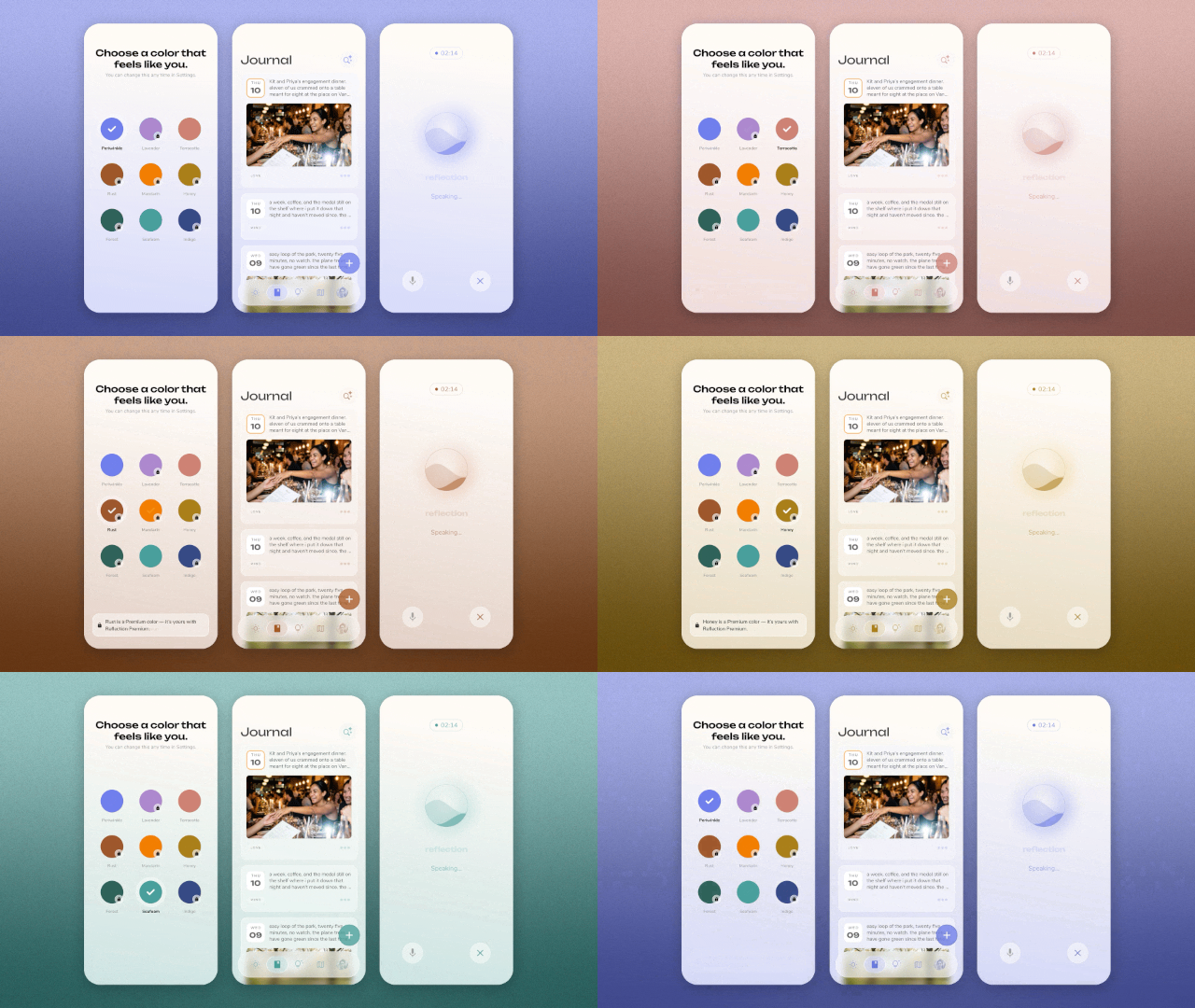
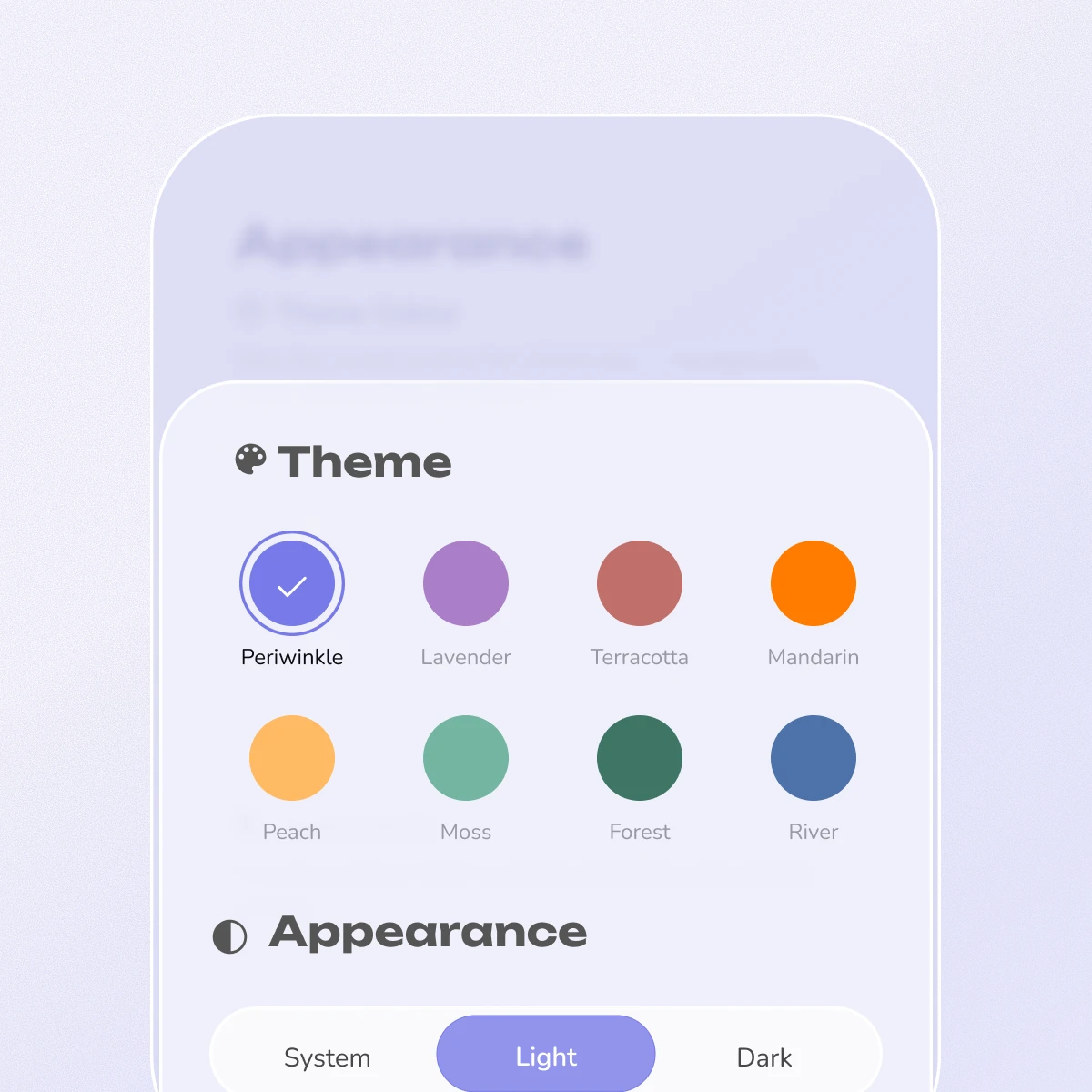
One of our most requested features. You can now further customize Reflection with colored themes.
New theme colors. Periwinkle, Lavender, Terracotta, Rust, Mandarin, Honey, Forest, Seafoam, and Indigo. Picking one re-tints everything: the background, every card, the nav bar, buttons, switches, even the charts in Insights.
Light and dark is its own setting. System, Light, or Dark, chosen directly rather than bundled into an appearance preset.
Small changes to where things live, which add up.
Settings is a tab. It used to be a small button on one screen that disappeared when you scrolled. It's now the fifth item in the bottom bar, with your profile photo as its icon.
A new tab order. Today, Journal, Insights, Guides, Settings — and search is back in the top-right corner.
Settings regrouped. Your account sits at the top. Everything else groups into Preferences, Advanced Features, Support & Share, and About Us, with a few clearer names: Your Plan is now Subscription, Advanced Security is Privacy & App Lock, and AI Preferences is Depth.
Notifications in one grid. One row per notification with a switch for push and a switch for email, instead of two lists naming the same things twice. The weekly review email now has a switch of its own.
Minimalist Mode. Prefer a quieter screen? Swap the five-tab bar for a single menu button and a New Entry button, and choose which page Reflection opens to. Both are at the bottom of Appearance.

The most visible change. Every surface moved from a solid card with a drop shadow to translucent glass with a lit edge and a subtle noise texture behind it, and the buttons and icons were reworked throughout. Rebuilding this much of the front end also made the app noticeably faster.
Glass and texture. We added some noise to the backgrounds for a bit of a tactile feel behind the glass and every color in the app comes from the theme you picked.
Wave Loaders. We created a new custom wave pre-loader inspired by our logo that now replaces a handful of disjointed loading animations.
Sheets and dialogs float. On a phone they sit clear of all four edges instead of clinging to the bottom; on desktop they center.
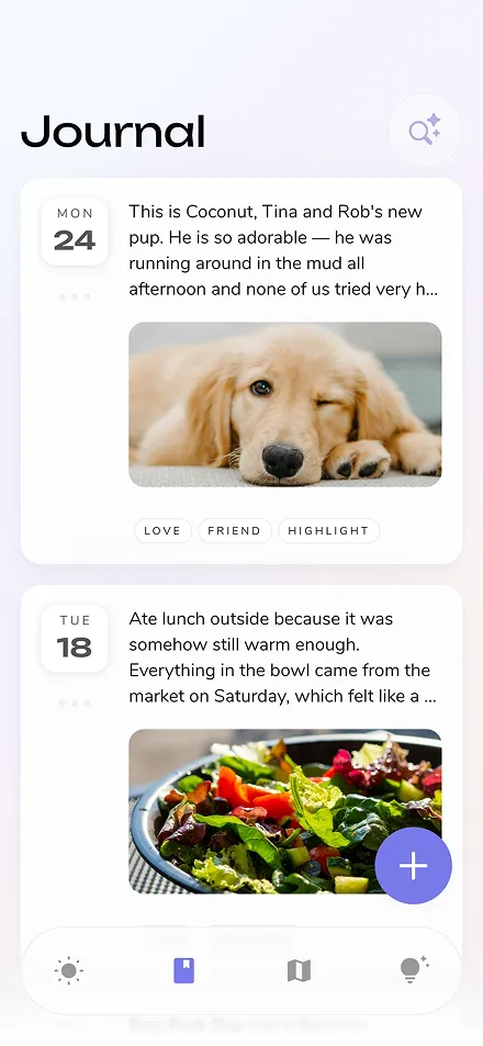
Journal cards. Photos are bigger, tags have more room, and an entry with more than one photo now shows how many.
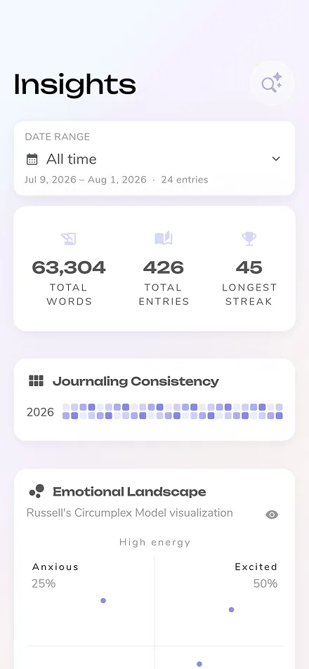
Insights and Guides. Both pages adopted new design stylings that also bring with them significant performance improvements.
Profile photos. Set one and it appears at the top of Settings and as your Settings tab icon, rendered as a duotone that follows your theme color.
It's faster. Scrolling, animations, and page loads are all quicker — most noticeably on the web, and in journals with a lot of photos.
Rebuilding this much of the app at once let us rethink everything from the ground up, and we think it shows. v7 goes to beta shortly, and will be available to everyone by the end of October. We can't wait for you to try it.
We'll do a proper tour when it lands. In the meantime, the best way to be first in line is to keep writing — beta invites go out to active journalers first.